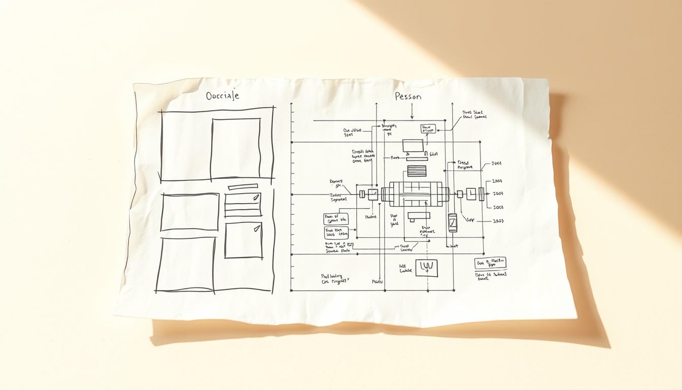
Have you ever wondered whether a quick napkin note can become a polished, shareable asset that drives decisions?
We show how a simple workflow turns rough ideas into clear content that teams trust. Our process guides you from pasted text content through fast visualization, refinement, and export. You keep control while visuals do the heavy lifting.
Think of this tool as an on-demand visual expert at your fingertips. Click the blue lightning bolt, generate visuals for each section, tweak labels or add images, and export as PPT, PNG, SVG, or PDF.
We focus on speed, clarity, and real-world use: collaborate with comments, shareable links, and permission levels so your work fits existing workflows and daily life.
Throughout this guide, we outline practical choices—when to keep things simple and when to build detail—so you can move from a napkin sketch to a professional result without extra design overhead.
Key Takeaways
- You can convert brief notes into structured content quickly.
- The tool generates visuals at the section level using a single click.
- Collaboration features—comments and permissions—support team alignment.
- Export options match common workflows: PPT, PNG, SVG, and PDF.
- Start with text to keep message control while visuals amplify it.
Why Turn a Napkin Sketch into a Digital Diagram
Converting quick thoughts into a structured visual speeds alignment across teams. We take brief notes and shape them into clear visuals that everyone can use.
From quick ideas to clear concepts that teams can share
A simple napkin or sketch often holds the core of a plan. Turning that note into a shareable diagram gives your ideas structure. Teams absorb concepts faster and act with fewer misinterpretations.
When visuals beat text for clarity and impact
- Reduce cognitive load: Visuals like diagrams show relationships and priorities at a glance, which is the point when clarity matters most.
- Single source of truth: A living diagram improves continuity between meetings and handoffs better than long paragraphs.
- Speed and control: You start from your content and choose how much detail to surface—a practical choice for tight timelines.
- Routine jobs improved: Status updates, training, and project overviews become quicker and more precise.
Because the output is editable, you can refine the diagram as the conversation evolves without rebuilding the whole thing. This process works much like other professional documentation practices but with faster iteration cycles and fewer bottlenecks.
What You Need Before You Start
Before you begin, make sure your workstation and account settings are ready so you move quickly.
Accessing the service on desktop
Start on a desktop—creation and editing work best there, while mobile remains view-only. Go to napkin.ai and create a free account. Use Google SSO or register with an email and password.

Accessing Napkin on desktop and creating your free account
After login, click the single “Create my first Napkin” button to open your first project. The interface is minimal so you can focus on content and structure.
Choosing whether to paste existing text content or generate text
You have a clear choice: paste existing text content for full control, or generate text to jumpstart an outline. Pasting preserves your original intent.
- Generate text if you want a quick, structured section text to visualize fast.
- Paste when precise wording matters—this helps the tool map your ideas more accurately.
- Prepare a short brief and clean headings. The blue lightning bolt appears next to each section text—click icon when you’re ready.
Note: Import from PPT, PDF, or Docs is planned and will appear in the FAQ section when available.
napkin sketch to digital diagram: The Core Workflow
Turn a quick idea into a clear visual in minutes with a repeatable, section-by-section process.
Start by pasting existing text content or choosing to generate text for a fast scaffold. Then hover left of the section text and reveal the blue lightning bolt icon.
Click the bolt icon and the tool returns multiple visual options. Scroll through visuals like diagrams and pick the diagram that matches your message and level of detail.
- Keep one concept per section so each visual stays focused.
- If ideas are dense, split the text into two smaller sections and regenerate the visual.
- Refine labels, icons, and layout after insertion rather than before.
When sequence matters, choose flow charts; when grouping matters, pick clusters or matrices. If you edit section text later, click the lightning bolt again to regenerate visuals and preserve alignment.
| Step | Action | When to Use | Result |
|---|---|---|---|
| 1 | Paste or generate text content | Starting a new section | Clear section text scaffold |
| 2 | Hover and click the lightning bolt icon | Ready to visualize | Scrollable set of visuals |
| 3 | Pick and insert a diagram | Match message & detail | Aligned visual under section |
| 4 | Refine text and regenerate | After edits | Updated visuals without rework |
Customizing Your Diagram Elements for Precision
Adjusting icons, labels, and layout gives each section clarity and alignment with your goals.
Click any icon to expose the secondary lightning bolt and swap visuals. That single action lets you replace a node with an icon that matches your concepts and intent.

Icons, connectors, and decorators that clarify ideas and concepts
- Click icon, then the bolt icon to swap shapes and symbols.
- Use connectors and decorators to show flow, priority, or grouping.
- Keep a consistent visual grammar so similar ideas share the same node type.
Labels, fonts, and colors that align with your content and brand
Use the Labeling Tool to add clear names and relationships. Standardize fonts and colors for legibility on light or dark backgrounds.
Sketching, swapping images, and adjusting layout for readability
Sketch directly on the canvas for quick annotations. Upload or paste images, then add frames to isolate important parts.
Using Spark Search to add the exact visuals you need
“Spark Search helps you find precise symbols and shapes that reinforce concepts without cluttering the page.”
| Action | How | Benefit |
|---|---|---|
| Swap element | Click icon → secondary lightning bolt | Aligns visuals with ideas |
| Find icons | Spark Search | Accurate symbols, less overload |
| Annotate | Sketch tool or Labeling Tool | Highlights exceptions and context |
| Insert images | Upload, drag-and-drop, or paste | Adds screenshots or branding |
| Polish | Fonts, colors, frames, spacing | Improves readability and brand fit |
Pro tip: Iterate lightly after reviews and keep a small style guide for recurring projects. This helps transform rough ideas into polished content visuals like reports or slides.
Collaboration and Sharing That Work Like Your Everyday Tools
Real-time editing and precise access controls make feedback feel like part of the work, not an afterthought.
Invite teammates into Teamspace so multiple editors refine content and visuals together. Add members by email and avoid version sprawl.
Use margin comments and the built-in highlighter to pin feedback exactly at the right point in text or visuals. This reduces ambiguity and cuts rework.
- Grant four levels of access—view, comment, edit, or edit-and-share—so reviewers see only what they need.
- Collaborate in real time and manage members centrally so decisions stay tied to the file.
- Resolve comments as you decide; keep the document clean and authoritative for stakeholders.
- For rapid cycles, let one editor apply changes while others comment, then swap roles to maintain momentum.
The sharing model behaves much like Google and other familiar platforms, so teams ramp up quickly with minimal training. When a visual needs clarification, reference the lightning bolt-generated section to keep context tight and feedback efficient.
Exporting and Reusing Your Visuals Across Projects
Exporting lets your visuals move from our canvas into the tools your team already uses. We make it simple to pick the right format and reuse work without redrawing.
Choose PNG, SVG, PDF, or PPT for any workflow. PNG is fast for sharing. SVG keeps lines crisp at any size. PPT gives editable slides. PDF locks layout for stable distribution.
Single-page vs multi-page PDFs
Use a single continuous PDF when flows must stay unbroken. Select multi-page output for print-ready packets or step-by-step handouts.
Export part or the whole document
You can export a selected part of your visual for a slide panel, or export the entire file for comprehensive handouts.
“Export and replace—update the source, then re-export to keep downstream assets current.”
| Format | Best Use | Key Benefit |
|---|---|---|
| PNG | Quick sharing, email, chat | Fast, widely supported |
| SVG | Large displays, detailed zoom | Scales without loss |
| PPT | Slide edits, speaker notes | Native layout control |
| Handouts, print packets | Stable, fixed pagination |
Pro tip: Keep your source content here, maintain a clear naming convention, and re-export as ideas evolve. This lets you transform existing text into fresh content visuals with minimal effort.
Practical Use Cases, Tips, and Examples
Build a single-page overview that anchors every kickoff and status update. Use a short section text for each major talking point, then generate visuals that let you speak to structure rather than read bullets. This helps your project run cleaner and decisions happen faster.
Presentations: Translate each talking point into its own section text block. Generate visuals and export as PPT for editable slides. Keep nodes limited—three to five per slide—so your audience stays focused.
Blogs and websites: Add a compact visual near the top to preview the argument, then place deeper panels where readers expect examples and evidence. This raises retention and shortens scan time.
Educators and projects: Turn lesson outlines into visual summaries that trim prep time and give students a clear map of concepts. For project teams, create a single-page overview, then attach sub-visuals for scope, dependencies, and risks.
- Use the “metaphor” example: define sections (understanding, components, examples, tips), generate text, then visualize each section.
- If you’re looking to cut meeting friction, circulate the visual beforehand and collect comments so live sessions focus on decisions.
- As a generative tool complement, start with generate text for structure, then replace wording to keep fidelity.
Tip:Keep a repeatable workflow—outline ideas, generate text where useful, create visuals per section, iterate with feedback, and export for the channel you need.
Conclusion
Finish with a simple, repeatable process that turns brief ideas into clear content and a professional diagram you can share. Keep each section focused on one idea, refine labels and elements, and add images where they matter.
Napkin helps transform existing notes into text content visuals using a single click per section. Use the generative tool for a quick scaffold, then replace wording to keep fidelity and brand voice.
Scale this across teams with Google‑style sharing and tight permissions. Export as PPT, PNG, SVG, or PDF and let the work travel where decisions happen. Start your next file today—outline ideas, generate visuals, iterate fast, and publish the part that drives results.
FAQ
What does "Transforming Napkin Sketches into Professional Documents" mean?
It means turning quick, hand-drawn ideas into structured, shareable visuals and written sections that teams can use for planning, presentations, and documentation.
Why should we turn a rough idea into a formatted visual?
Visuals often communicate relationships and workflows more clearly than blocks of text. They speed comprehension, reduce meeting time, and make decisions easier for stakeholders.
When are visuals better than text for sharing concepts?
Use visuals when you need to show flow, hierarchy, timelines, or complex relationships—whenever a diagram removes ambiguity and focuses attention on the key message.
What do we need before starting a transformation?
Have an account on the platform, your existing text or notes ready, and access to any brand assets (logos, fonts, color specs) you want to include.
How do we access the tool and create an account?
Visit the web app on desktop, click sign-up, and follow the prompts to create a free account. Sign-in options typically include email and single sign-on with Google or Microsoft.
Should we paste existing text content or generate new text in the editor?
Both work. Paste existing content to preserve original wording, or generate concise sections when you need clearer, structured language for the visual.
What is the core workflow for converting an idea into a visual?
Paste or generate your content, click the lightning bolt icon to suggest layouts, review visual options, then pick and refine the design that fits your message.
How do we browse and pick the right visual option?
The tool presents multiple layout templates and element sets. Preview each option against your content, then select the one that maximizes clarity and aligns with your intent.
How detailed should we refine each section of the visual?
Aim for readable chunks: clear headings, a short descriptive sentence per section, and a simple visual cue for each idea. That makes the diagram scannable and actionable.
What customization options are available for diagram elements?
You can add icons, connectors, labels, and decorators; adjust fonts and colors to match your brand; swap images; and fine-tune spacing for better readability.
How does Spark Search help when customizing visuals?
Spark Search finds specific icons, illustrations, or images that match your keywords so you can add precise visuals without leaving the editor.
Can teams collaborate in real time on a visual?
Yes. The platform supports comments, live editing, and shared teamspaces so multiple contributors can review and update the work together.
How do we share drafts and control access?
Share links with view, comment, edit, or edit-and-share permissions. Use teamspace roles to manage who can publish or export final files.
What export formats are supported for reuse across projects?
You can export as PNG, SVG, PDF, or PPT to fit presentations, print handouts, or web content workflows.
When should we choose single-page versus multi-page PDFs?
Single-page PDFs work for posters and handouts; multi-page PDFs are better when you need slide-style navigation or separate sections for detailed documentation.
What are common practical use cases for these visuals?
Use them for presentations, blog posts, websites, teaching materials, project plans, and stakeholder summaries—any context where visuals speed understanding.
Do you have quick tips to make visuals more effective?
Keep language concise, use consistent iconography, apply brand colors sparingly, and prioritize white space so each element is distinguishable at a glance.
Can these visuals help repurpose existing text content?
Yes. The tool can transform paragraphs into structured visuals and concise section copy, saving time and improving how your content reads and looks.
Is content kept private and secure while we work?
The platform follows standard security practices—account authentication, access controls, and export options—so your drafts remain private to your team unless you share them.
Leave a Reply